Why is Peterborough United looking at a rebrand?
 Getty Images
Peterborough United are looking at a "brand evolution" that could mean changes to their 2008-designed crest. Following in the footsteps of Cambridge United, Norwich City and countless others, Posh wants to sharpen their look for the digital age and hear from supporters. But would fans prefer to focus on football, not fonts?
What's the history of the current crest?
 Getty Images
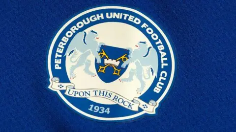
The crest, created in 2008, is based on the city's coat of arms, which features cross keys and the motto "upon this rock".
Both originate from the Bible and the story of St Peter, on whom the name of Peterborough is based.
It also features a towered crown, believed to represent the city's walls, and the date the club was founded. The eagle wings and lions relate to gentry associated with Peterborough.
The coat of arms itself is not exclusive to the club, of course. It's found on taxi firms, rowing and hockey clubs, and a troupe of Morris dancers use a similar design.
Why is the club thinking of changing it?
 PA Media
The coat of arms may well represent the city of Peterborough, but it's quite busy - and busy isn't a look brands are going for in 2025.
"The name of the game is to be instantly recognisable," explained Ben Stevenson, Peterborough United commentator for BBC Radio Cambridgeshire.
"The marketplace is incredibly crowded - there are 92 clubs in the top divisions, and every single one of them is doing the same thing.
"They are all trying to attract new fans, advertising and want to stand out."
Clive Edwards, head of media and marketing at Peterborough United, said it had to consider how the crest was used - across the kit, on social media, and on "sub-brands" that did not exist in 2008.
They include the Posh+ streaming service and Posh Rewards loyalty scheme, with other revenue streams likely to follow, Mr Edwards added.
"The challenges with the complexities of the existing crest lead us to believe there are areas where we can improve," he added.
How have fans reacted?
 PA Media
Matt Walker, a lifelong Posh fan and self-confessed "traditionalist", said he believed the crest should be the coat of arms of the city, with the cross keys and motto retained.
"Everything nowadays has to be aimed for the digital market - clean lines, sans serif fonts and minimalist designs," added Mr Walker, who works in design.
"The problem with this is it's a football crest and not a company logo.
"It still needs to look good on letterheads and club blazers."
Toby Wood, vice chair of the city's civic society, said the club should be careful not to do anything "too bland" or too far removed from the current crest.
"It is distinctive and it fits in with the element of being Posh - slightly upmarket and rather grand," he added.
Tattooist Hayley Mears has inked the crest for customers at her studio at Orton Goldhay.
"I do think it needs to stick to some of the original design," she said.
"I've seen some of the clubs locally that have done this and they [the redesigns] don't have any character in them.
"It loses itself and becomes a marketing thing."
Has this been successful elsewhere?

Norwich City freshened up its Canary crest for the 2022-23 season and Cambridge United are due to launch their redesigned look next season.
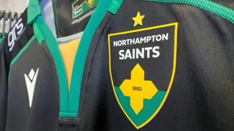
Last year, Northampton Saints' simplified crest was hailed by some as clear and easily recognisable, while others complained it was like a last-minute effort for a school project.
Designer Chris Payne, who put forward three ideas for Cambridge United, including their new book and ball crest, has been drafted in to work his magic for Peterborough.
"He's incredibly experienced at this - he's done this for loads of clubs, some non-league and some in the US," said Ben Stevenson.
What happens now?
For now, the club is starting a consultation about the possibility of a rebranding and is keen to hear from anyone with an interest in the club.
The 18-month process starts with a fan survey.
"At the moment we are in the research and listening phase," added Mr Edwards.
"It's really important to hear how fans feel about the existing crest."
Events connected with the rebrand are expected to be announced later.
If a redesign is agreed, a final sign-off would happen in October, with the branding rolled out in time for the 2026-27 season.
Follow Peterborough news on BBC Sounds, Facebook, Instagram and X.
